In visual storytelling, you’ll usually apply three different types of images: iconic images, symbolic images, and indexical images. There is no one type of image that is “best” suited to web design. Each one can be used, often simultaneously on the same project, to achieve the desired results.
Let’s have a look at the characteristics of each type of image, then examine the best scenarios of use.
Iconic Images
Iconic images are instantly recognizable and strongly associated with a defined concept. They’re also generally very literal images, so even someone not familiar with them can deduce a general meaning. They look like what they mean. Think about the symbols for male and female restrooms. A human figure in either pants or a dress is considerably easy to interpret, regardless of whether you’d ever seen these images or not, or whether their meaning had ever been explained to you.
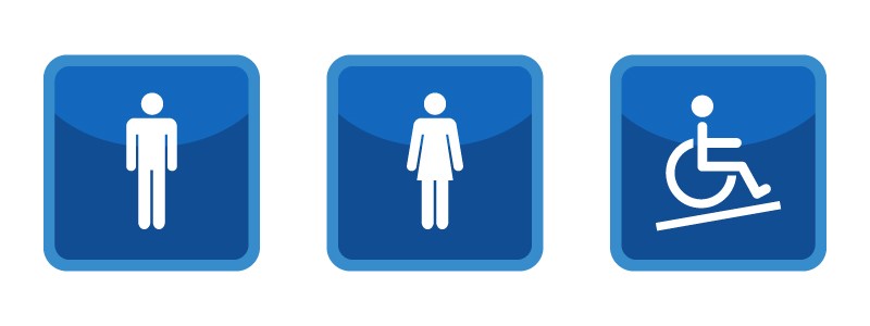
Things like arrows, wheelchairs, and icons that are simplified forms of physical things, also often fall under iconic imagery. Icon sets are often an excellent source for iconic images, as they need to be obvious and easy to interpret with or without text labels.
Diagrams, charts, and scientific illustrations are all examples of iconic imagery. They very literally represent information in a way that is hard to misinterpret (which is the cornerstone of an iconic image). Think about the icons you’ll likely encounter on the web or in an application:
- envelopes to indicate email
- a trash can to indicate deleting something
- a house to indicate the home page
- a disk to indicate saving something
- a check mark to indicate task completion
Regardless of prior familiarity with these icons in a specific setting, most users will be able to make an educated guess about what gets triggered by clicking on these icons. While some icon imagery may have started out as symbolic, many are so widely recognized now that they have become iconic. For example, the folder icon is pretty much universally recognized as a symbol to open a file, but the folder itself doesn’t indicate this without its longstanding cultural association. The same applies to the commonly-seen “gear” icon to access settings, along with the icons for deleting and downloading, and many others.
![]()
This is a common result of an image becoming a part of mainstream culture: its meaning can become so fixed that it is universally recognized, even if originally that meaning had to be learned. You don’t need to always break new creative ground: use widely accepted icons to create a baseline understanding, then add creative flourishes as needed. One thing to keep in mind: not all icons are iconic. Some still need to be explained before they are correctly interpreted.
Designers sometimes opt to use icons that are customized to their own site’s design or theme, but those kinds of icons may need to be labelled for clarity, as they’re purely symbolic. At the very least, a label should appear when they’re hovered over. In cases where you want users to instantly recognize the meaning of an icon, stick with images that are actually iconic.
Symbolic Images
Symbolic images are more abstract than iconic images, and often do more to convey a feeling or general idea than a specific concrete object. Symbolic images are very often seen in logos, as they reinforce the feelings a brand wants to convey.
For example, the Microsoft Windows logo is an abstract representation of a window, but isn’t a direct interpretation. Someone could interpret it to represent something else, particularly if they come from a culture where a different style of window is more common.
![]()
Symbolic images generally need to have their meanings taught. They are not instantly recognizable, because they are not literal. Until the meaning is learned, they can be widely open to interpretation. Instead, symbolic images use semiotics – visual grammar – to convey meaning more than iconic images do. Symbolic images are visual metaphors, and those metaphors often must be learned to be interpreted correctly. Granted, many symbols are recognized on a cultural level, due to their common usage associated with specific things or ideas. One example would be traffic signs, like stop signs (which are eight sided in most countries, but in Japan, are only three-sided and more closely resemble the US “yield” sign, and in numerous other countries the sign is a circle with a triangle in it). And if you asked someone from one country what the traffic signs of another country meant, they would likely get a considerable percentage of them incorrect.

This is because these images are symbolic, rather than iconic. Their meanings need to be taught, and are often based on cultural associations rather than universal understandings. One example in the web design world is the hamburger menu icon. While it does somewhat resemble a menu, the image is too abstract to accurately be called iconic. Thus, one study found that its interpretation is age-sensitive. In fact, 80% of users between 18-44 understood its meaning, while only 52% of older users understood.
Indexical Images
Indexical images link meanings between the image’s appearance and its representation. For example, a thermometer showing it’s below zero indicates that something is cold. Indexical images are some of the most commonly found images in advertising and design. We tend to shy away from representing things too literally, often because we prefer to evoke an emotion rather than shove literal information down the user’s throat.
Consider these two examples:
- For sadness, would you use an image of a person crying (literal), or a dark, cloudy day with rain pouring down and a kid’s bicycle sitting unused and soaked in the front yard (emotional)?

- To evoke happiness, would you use an image of someone smiling(literal), or a cute puppy playing in the sand (emotional)?

Both types of images are indicative of an emotion, but the latter example in each is more likely to make the user feel something, rather than just think of the word for the emotion.
Let’s say that you want to make people nostalgic when they visit your website. There are several ways to do that, but starting with images that evoke that feeling without screaming “NOSTALGIA” are a good place to start. If your target audience is likely to be in their 30s, you might use imagery that evokes the 1980s, as that’s the time when your audience was growing up. You can achieve the same effect with more abstract visual elements like color palettes. Using a neon color palette reminiscent of the late 80s and early 90s is immediately going to create a much different impression than a color palette of rosy pinks and muted aquas that were more common in the 1950s.
All three images have their place in good design. As with all design techniques, it all depends on the parameters of your project. Do some free association with those concepts and the types of images you might use. Search for images based on those concept keywords, too, and start brainstorming on what might best work together, as well as things you want to leave out.
Contact Taksa for your Outsourcing Design Project requirements and see how our designers incorporate such extraordinary branding philosophy into your brand for great marketing success.