
We all know the scroll bar is a UI component which commonly located on the far right or bottom of a window that allows you to move the window viewing area up, down, left, or right. Most people today are familiar with scroll bars because of the need to scroll up and down on almost every web page and application.
Problems with the scrollbar in web-application
- All operating systems have a different type of Native Scrollbars and most browsers inherit OS-specific scrollbar, which makes your web-application Scrollbar’s look & feel different on different OS. Web-kit based browsers support scrollbar UI customization through CSS but what about others?
- They take some extra space horizontally or vertically which reduce the available space for your web page content or your content container like a table(WebKit based browsers provides an overlay value make scrollbar to draw on top of content to get rid of these extra space but again what about other browsers?)
Motivation
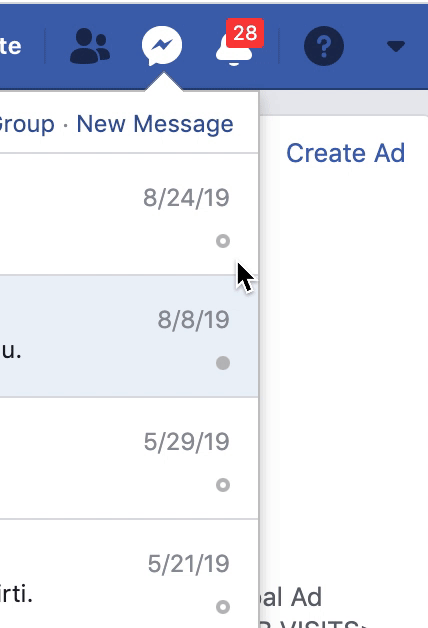
- Facebook: I have found a custom scrollbar in Facebook messenger pop-up, which appears on hovering.
- Gmail: You can also notice similar scrollbar in Gmail below the Email compose button on hovering
- You might have noticed similar Scroll bar in other Applications even in ‘Code sandbox’ project you can notice similar scrollbar
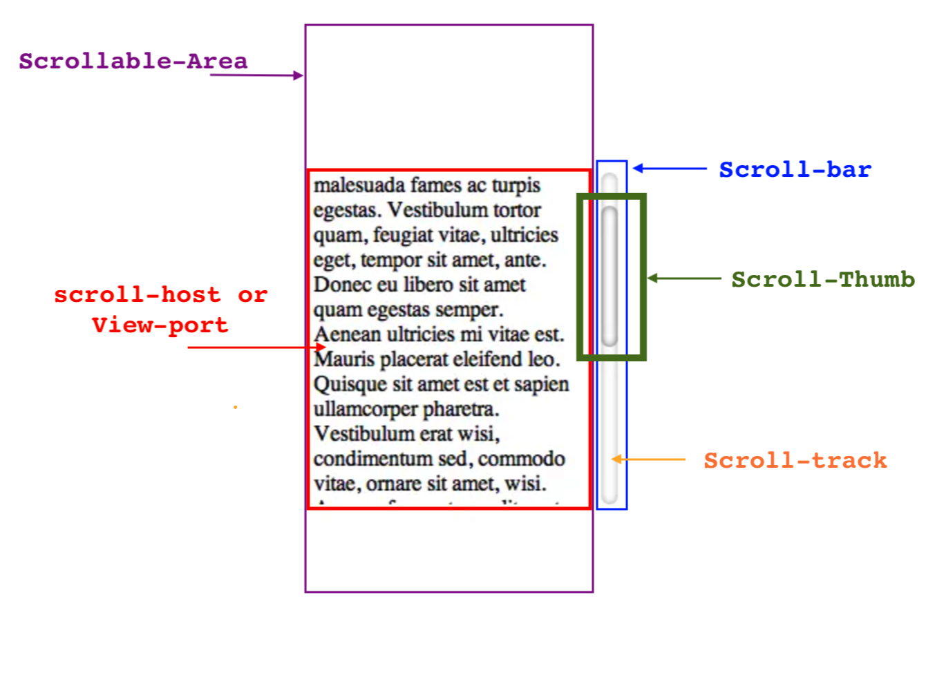
In this story, I will walk you through the steps on how to create the custom scrollbar in React, we can use the same technique in other Front-end Frameworks like Angular but before taking a deep dive, let’s visualize the different components of a scroll-bar.
Complete Code-Sand-box project Link
Steps we need to perform
- Hide Browser’s Native Scroll-bar
- Add Custom Scroll-Bar UI, this will be visible on mouse hover
- Add Custom scroll-thumb in scroll-bar
- Calculate scroll-thumb Height based on scrollable content
- Change scroll-thumb position on mouse scroll in scroll-host
- Change scroll-thumb position on mouse drag
All these steps have explained below in great depth
Hide Native Scroll-bar
First things we need to do is to Hide the native scroll-bar of the browser on the scroll-host element, don’t disable the scrolling through overflow: hidden
Why? we will see the reason soon.
Below is the CSS to hide the scroll-bar on different browsers. Here is the link of code sandbox project where I have used the below CSS to hide scroll-bar on my scroll-host container
.scrollhost {
   scrollbar-width: none;
  -ms-overflow-style: none;
}

.scrollhost::-webkit-scrollbar {
  display: none;
}
So, we get-rid off the Browser Native scroll-bar through the above steps. Before moving to the next steps, I have created a Code Sandbox Project, which has a complete implementation. Users with an intermediate or higher level of experience can directly move there to understand the logic directly from the code. Although, I would recommend reading through the article to understand everything in detail.
Let’s create our custom scrollbar
Next step is to render a Scroll-bar and Scroll-box thumb over our scroll-host which will help us to scroll the content through mouse drag. First, we will add a scroll-bar that will appear on hovering. Below is the code snippet along with its CSS.
import React, { useState, useCallback } from "react";
import "./onHoverStyle.css";

export default function CustomScrollDiv({ children, className, ..restProps }) {
  const [hovering, setHovering] = useState(false);

  const handleMouseOver = useCallback(() => {
    setHovering(true);
  }, []);
  const handleMouseOut = useCallback(() => {
    setHovering(false);
  }, []);

  return (
    <div
      className={"scrollhost-container"}
      onMouseOver={handleMouseOver}
      onMouseOut={handleMouseOut}
    >
      <div
        ref={scrollHostRef}
        className={`scrollhost ${className}`}
        {...restProps}
      >
        {children}
        <div
          className={"scroll-bar"}
          style={{ opacity: hovering ? 1 : 0 }}
        >
        </div>
      </div>
    </div>
  );
}
.scroll-bar {
  width: 10px;
  height: 100%;
  right: 0;
  top: 0px;
  position: absolute;
  border-radius: 7px;
  bottom: 0px;
  background-color: rgba(0, 0, 0, 0.35);
}
.scrollhost-container {
  position: relative;
  height: 100%;
}
So, now we have separate reusable component name CustomScrollDiv, which is rendering your content in it along with scroll-bar, and this scroll-bar will be visible only when the user is hovering your CustomScrollDiv component.
Render
- Scroll-host: it represents your custom div container which will render custom scroll-bar on hover, it is going to hold scrollable content(at line 25 it is rendering children props), any props you will provide to CustomScrollDiv will get applied on this div. Refer to line 23
- Scroll-bar: This is going to hold the scroll-thumb and provide a tracking area for scroll-thumb. In the later section, we will add scroll-thumb in this component. Here, we are leveraging the absolute positioning CSS property to render the scrollbar container over our scroll-host at the fixed position keeping its height equal to 100% of Scroll-host-container.
- Scroll-host-container: It is a container/wrapper of your actual component aka scroll-host. Being a container, It is listening mouse over and mouse out event(line 17, 18) instead of scroll-host.
why do we need this?
This will help us to keep the scroll-bar height equal to the client height of scroll-host, without this you have to keep the height of scroll-bar equal to scrollHeight of scroll-host which will cause a flickering issue when you have very large scrollHeight(I will explain this in the last section)
State
For now, we are keeping only a single state i.e. hovering,
we are changing its value under mouseout and mouseover event handler registered on Scroll-host-container. As we move forward, we will add more states
Now with above component and CSS in place, you will notice that scroll-bar is visible on hovering and your content is still scrollable
Do you know why your content is still scrollable?
To hide the scroll-bar we did not use the overflow: hidden, which does two things to scrolling
- Hides the scrollbars
- Disallows the user to scroll the content
With this, you have also got the answer to the above question.
Let’s hold the scroll bar, Scroll-Thumb it is
Our next step is to render the Scroll-thumb (box) or scroll-holder, through which a user can not only scroll the content through mouse dragging but it helps the user to identify the length of scrollable content with its positioning relative to scroll-bar. This is the most critical/complex part of this implementation. So, be attentive else first have a cup of coffee/tea 🍮 😉.
Scroll-thumb Rendering
First, we will add a new div element inside scroll-bar representing scroll-thumb
   <div className={"scroll-bar"} style={{ opacity: hovering ? 1 : 0 }}>
        <div
          className={"scroll-thumb"}
          style={{ height: scrollBoxHeight, top: scrollBoxTop }}
        />
   </div>
Scroll-thumb height calculation
- Next, we have to find the height of this scroll-thumb based on the scrollable content, its time to refresh the basic mathematic percentage formula.
- Don’t take much stress its a simple math. Before moving to the formula, let’s understand the below terminology
clientHeight : it’s the inner height of an element
scrollHeight: it’s the height of an element’s content
- Now, here is the formula where the height of RHV of scroll host or area which is scrollable
scrollThumbHeight = (clientHeight/scrollHeight) * clientHeight
scrollThumbHeight = (clientHeight/scrollHeight) * clientHeight
//...other code blocks
//did mount block
const SCROLL_BOX_MIN_HEIGHT = 20
const [scrollBoxHeight, setScrollBoxHeight] = useState(SCROLL_BOX_MIN_HEIGHT);

const scrollHostElement = scrollHostRef.current;
const { clientHeight, scrollHeight } = scrollHostElement;
const scrollThumbPercentage = clientHeight / scrollHeight;
const scrollThumbHeight = Math.max(
  scrollThumbPercentage * clientHeight,
  SCROLL_BOX_MIN_HEIGHT
);
setScrollBoxHeight(scrollThumbHeight);
- Set the minimum height of 20 px of scroll-box to avoid the negative height of the scroll box in case of very big scrollable content.
- In React, we will calculate this height just after our CustomScrollDiv element gets mounted in DOM, you can use the componentDidMount lifecycle method in case of the class-based component or useEffect hooks for a functional component.
Scroll-thumb positioning
- In order to change the position of above scroll-thumb on mouse-scrolling, we need to follow below steps
1. handle the scroll event on scroll-host
2. Change the top position of scroll-thumb on every scroll movement in handler registered in step 1 based on the following formula
scrollThumbTop = (scrollTop/scrollHeight) * clientHeight
scrollThumbTop = (scrollTop/scrollHeight) * clientHeight
- after this change, CustomScrollDiv component will look like this
import React, { useState, useCallback, useEffect, useRef } from "react";
import "./onHoverStyle.css";

const SCROLL_BOX_MIN_HEIGHT = 20;

export default function CustomScrollDiv({ children, className, ...restProps }) {
  const [hovering, setHovering] = useState(false);
  const [scrollBoxHeight, setScrollBoxHeight] = useState(SCROLL_BOX_MIN_HEIGHT);
  const [scrollBoxTop, setScrollBoxTop] = useState(0);

  const handleMouseOver = useCallback(() => {
    !hovering && setHovering(true);
  }, [hovering]);

  const handleMouseOut = useCallback(() => {
    !!hovering && setHovering(false);
  }, [hovering]);

  const handleScroll = useCallback(() => {
    if (!scrollHostRef) {
      return;
    }
    const scrollHostElement = scrollHostRef.current;
    const { scrollTop, scrollHeight, offsetHeight } = scrollHostElement;

    let newTop =
      (parseInt(scrollTop, 10) / parseInt(scrollHeight, 10)) * offsetHeight;
    console.log(newTop, scrollBoxHeight, scrollTop, scrollHeight, offsetHeight);

    console.log(offsetHeight - scrollBoxHeight);
    // newTop = newTop + parseInt(scrollTop, 10);
    newTop = Math.min(newTop, offsetHeight - scrollBoxHeight);
    setScrollBoxTop(newTop);
  }, []);

  const scrollHostRef = useRef();

  useEffect(() => {
    const scrollHostElement = scrollHostRef.current;
    const { clientHeight, scrollHeight } = scrollHostElement;
    const scrollBoxPercentage = clientHeight / scrollHeight;
    const scrollbarHeight = Math.max(
      scrollBoxPercentage * clientHeight,
      SCROLL_BOX_MIN_HEIGHT
    );
    setScrollBoxHeight(scrollbarHeight);
    scrollHostElement.addEventListener("scroll", handleScroll, true);
    return function cleanup() {
      scrollHostElement.removeEventListener("scroll", handleScroll, true);
    };
  }, []);

  return (
    <div
      className={"scrollhost-container"}
      onMouseOver={handleMouseOver}
      onMouseOut={handleMouseOut}
    >
      <div
        ref={scrollHostRef}
        className={`scrollhost ${className}`}
        {...restProps}
      >
        {children}
      </div>
      <div className={"scroll-bar"} style={{ opacity: hovering ? 1 : 0 }}>
        <div
          className={"scroll-thumb"}
          style={{ height: scrollBoxHeight, top: scrollBoxTop }}
        />
      </div>
    </div>
  );
}
Scroll-Thumb dragging
- Now, we have scroll-bar and scroll-thumb of the correct size and they are also moving correctly on mouse scroll in the scroll-host area. Still, mouse dragging on scroll-thumb is not working, let’s see how can we handle that:
- To handle the dragging on scroll-thumb, we need to handle the
1. mouseDown event on Scroll-thumb element and
2. mousemove, mouseup & mouseleave on document
Why document?
because while dragging you can move your mouse anywhere in the document, this is the default behaviour in all scroll-bar, you can verify this behaviour by doing scrolling while reading this story
- To identify if a user is dragging scroll-thumb or not, we will keep the state isDragging in component and also need to store the Y coordinate of Scroll-Thumb element when a user starts dragging
- Now, let’s walk through what we need to do in each event handler
First mouseDown Handler on scroll-thumb
Mouse down on Scroll-thumb implies, a user going to start dragging through Scroll-Thumb, so, we are keeping the current Y coordinate location of Scroll-Thumb, and changing isDragging state to true
  const handleScrollThumbMouseDown = useCallback(e => {
    e.preventDefault();
    e.stopPropagation();

    setScrollThumbPosition(e.clientY);
    setDragging(true);
  }, []);
Document mouseleave and mouseup event
mouseLeave and mouseUp event on document signify user going to stop the dragging if it is currently dragging the mouse-thumb, so we are changing isDragging state to false
    handleMouseUp = e => {
      if (this.state.isDragging) {
        e.preventDefault();
        this.setState({ isDragging: false });
      }
    };
Document mouseMove Handling
To give scrolling effect on dragging, we need to change the scroll-top of the below components:
- Scroll-Thumb: The change in scroll-top of scroll-thumb is the vertical change in the mouse position during dragging. To calculate that value we need the last scroll-thumb position which we have saved in lastScrollThumbPosition state. At line 9(see below) we are getting change in scroll-thumb position and in line 15 we are incrementing scroll-thumb top by that value.
- Scroll-Host: The change in scroll top of scroll-host is calculated using below formula, if you have noticed new scroll-top is the percentage of change in mouse position during dragging.
newScrollHostTop = (scrollHeight / offsetHeight) * deltaY;
newScrollHostTop = (scrollHeight / offsetHeight) * deltaY;
we are calculating this change in scrollTop at line 10 and applying this at line 20
  const handleDocumentMouseMove = useCallback(
    e => {
      if (isDragging) {
        e.preventDefault();
        e.stopPropagation();
        const scrollHostElement = scrollHostRef.current;
        const { scrollHeight, offsetHeight } = scrollHostElement;

        let deltaY = e.clientY - lastScrollThumbPosition;
        let newScrollHostTop = (scrollHeight / offsetHeight) * deltaY;

        setScrollThumbPosition(e.clientY);
        setScrollBoxTop(
          Math.min(
            Math.max(0, scrollBoxTop + deltaY),
            offsetHeight - scrollBoxHeight
          )
        );
        scrollHostElement.scrollTop = Math.min(
          scrollHostElement.scrollTop + newScrollHostTop,
          scrollHeight - offsetHeight
        );
      }
    },
    [isDragging, lastScrollThumbPosition, scrollBoxHeight, scrollBoxTop]
  );
Now, we have achieved our goal and our Custom scroll-bar on hovering is ready which is also working on mouse dragging on Scroll-Thumb, this is how it will work now.
Conclusion
I have tried my best to keep this story easy to understand though, it requires prerequisite like React, React-Hooks, DOM layout, JS DoM API etc. Some sections might require extra elaboration but to keep the story concise and understandable for all kind of users I have mentioned only important points. Feel free to ask your doubts and suggestions in the comments section below.
You are free to use the CustomScrollDiv Component in your code but for production, you might need to handle extra stuff like, currently, I am calculating scroll-thumb height only after component mount, but it can change if a user resizes windows or if your scroll-host load data lazily and change scrollHeight lazily.
Voila!! Now, we have our own Custom Scroll bar 🙂
Stay Safe and Keep coding!!
Originally Published on Medium
Contact Taksa for your Outsourcing Web Development Project requirements and see how our developers incorporate best scalable application framework into your project.


