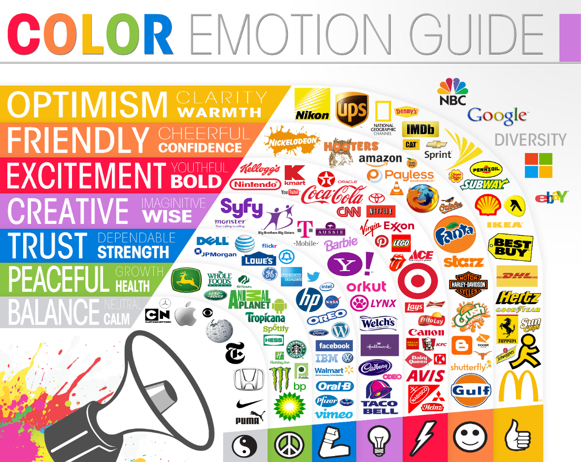
One of the most important goals for any brand is to make sure that they are instantly recognizable and create a unique experience mostly for, but not limited to, their audience. There are a number of ways to achieve this goal, but one of the most interesting and yet most controversial aspect is the Psychology of color.
To understand this better, take any of the most well-known brands in the world – Coca-Cola, McDonalds, Facebook etc. Did you immediately see Bright Red, Yellow and Blue when these brands are mentioned? Only a fraction can actually achieve this level of recognition, and this is not just due to a color choice, it’s because brands are built over time. With that said, it’s only reasonable to pick a color that does 3 things – Resonate with target audience, Capture the emotion and tone of one’s brand and make you distinct from your competition.
However, this is easier said than done. A lack of in-depth analysis has always been an issue as color theory is a subject of complexity and nuance and even though colors are too dependent on personal experience to be translated into specific feelings, broader conveying patterns are found in the way colors are perceived. People often do make snap judgement based on colors alone, but it varies from product to product. The crucial thing to consider here is, that the relationship between a brand and colors hinges closely on if the color used is appropriate or fit for the product being sold. To demonstrate this, let’s take the example of McDonalds again, psychologically, yellow is the happiest color in the color spectrum, which bodes well for their brand and the products they sell (think ‘Happy Meals’). Now instead of that bright, cheerful yellow, if they would’ve used somber tones like gray or dark blue, it would’ve created a stark contradiction in what they want to sell and what their brand is conveying.

So an effective marketing strategy makes it essential to understand what a color means and its impact in branding. What does it represent and how does it relate to your brand and marketing strategy? What emotion it evokes and why? It’s useful to know if the used color schemes are a good match from a subconscious and psychological perspective.
Colors influence how customers view the “personality” of the brand, and the way a brand is perceived hugely affects the purchasing intent of the customers. Numerous studies have shown that our brains prefer brands that are instantly recognizable, which makes colors one of THE most essential parts of your brand identity.
The hardest part of this process though is to give your brand a unique and distinct recognition, which doesn’t necessarily need a distinct color, as color is not the only interaction people have with you. If a color in your industry space is taken, doesn’t mean any random color could be picked. You need to understand what’s best for business and product before choosing to be different just for the sake of it. You can have nearly the same colors as others do and still have a unique presence as long as you know your brand and have faith in services that you offer.
So when it comes to picking the right colors predicting consumer reaction to color appropriateness is more important than the individual color itself. Therefore, there are no clear-cut, “right” colors as far as branding is concerned, and as clicked and frustrating as it may sound, “It depends” is your true answer. But it begs to take into consideration the context you’re working within.
At the end of the day what matters is the feeling, mood and image that a brand or product creates. Not an easy task by any means, but a very important thing to remember here is, just like your logo, a color is a part of the story that a brand creates which acts as a conversation starter with your consumers, and with the growth in conversation, your brand’s recognition will grow as well in the years to come.
When it comes right down to it, there really are no hard and fast rules when it comes to choosing a color scheme or visual identity for your brand. If you remember, originally Apple had a rainbow Apple logo which might have not worked well today but at that time and for that era, it served its purpose. Fast forward to today, the company’s minimalist product design is reflected on their website’s color scheme, which favors grays, blacks, and whites.
In other words, effective color schemes are largely subjective. Fortunately, one of the great things about design lies in its ability to be tested, changed, and tested again. So, don’t be afraid to experiment with colors and use the research and applications available to challenge preconceived notions and see what clicks with your audience.
Contact Taksa for your Outsourcing Design Project requirements and see how our designers incorporate such extraordinary branding philosophy into your brand for great marketing success.


